

Wipro launches new logo after two decades
After a period of two decades, Wipro has launched its new logo, which is designed around dots reflecting the groups philosophy of connecting the dots for its clients
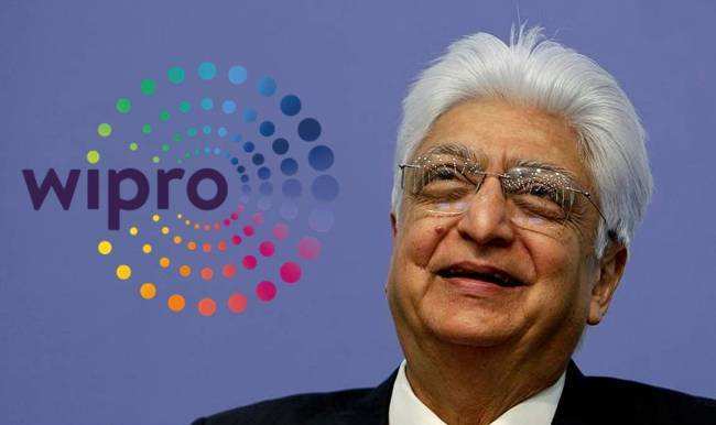
After a period of two decades, Wipro has launched its new logo, which is designed around dots reflecting the groups philosophy of connecting the dots for its clients.
Azim Premji, the benevolent and enterprising Chairman of Wipro, the third largest IT company in the country said, “Our brand identity is a visual expression of what we do and mean, for our clients… Our re-articulated values connect and resonate deeply with the new, vibrant, brand identity”.

The old Logo launched in 1998
In 1998, the multicolored Wipro sunflower logo was launched amidst much fanfare. Highlighting the concept of “Applying Thought” throughout the group, Wipro had launched the rainbow sunflower, highlighting the four values – integrity, human values, innovative solutions and value for money. The brightness of the rainbow manifested the company’s value for integrity, while its fresh appearance reflected human values.
The basis of the new logo, comprises of dots, which Wipro says is “connecting the dots” for its clients. A spokesperson from Wipro also said that the new identity marks the companies emergence as a trusted digital transformation partner to its clients “delivering at global scale with increasing localized capabilities”.